AAMC: Homepage Redesign for Improved User Experience
As the lead product manager for the AAMC homepage redesign, I launched the project to align our strategic vision with a more intuitive user experience. I initiated the wireframes, which were thoughtfully refined by the UX and UI designers to ensure alignment with user needs, business goals, and technical requirements. Since launch, engagement has increased by 200%, validating our data-driven approach and collaborative process.
Problem-Solving:
- Complex Navigation: The previous navigation system was overly complicated, creating friction for users trying to access important content.
- Content Overload: The homepage was cluttered with text-heavy content, making it difficult for users to quickly find the information they needed.
- Hidden CTAs: Important call-to-action buttons were not easily visible, leading to lower engagement rates.
- Ineffective Search: The search bar was difficult to find, and users often encountered irrelevant results, increasing frustration and bounce rates.
Process:
Leveraged Existing Research & Stakeholder Interviews:
In my role as product manager, I synthesized existing user research and supplemented it with targeted stakeholder interviews. These insights were crucial in defining a design strategy focused on simplifying navigation, prioritizing essential content, and improving search functionality.
Wireframing & Collaboration:
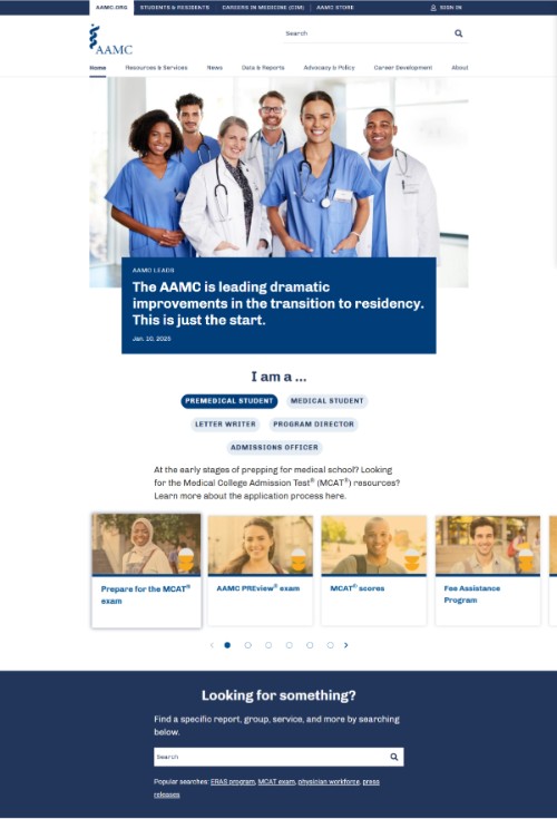
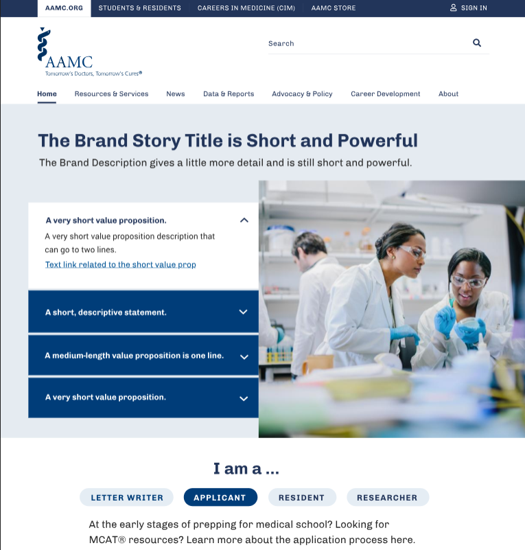
I created the initial wireframes to outline a new homepage structure, organized into four key areas:
- Who We Are: Highlighting AAMC’s mission and impact.
- Priority Tasks: Featuring essential CTAs like MCAT registration and residency information.
- Centralized Search Function: A more prominent and optimized search bar.
- Dynamic Content: Tailored content for users based on their roles.
These wireframes were handed off to the UX and UI designers for further refinement. I worked closely with the design team to ensure the final designs met our strategic goals and addressed usability improvements identified through research.
Collaboration with Developers and Stakeholders:
As product manager, I facilitated communication between design and development teams, ensuring technical feasibility while maintaining alignment with business objectives. Regular feedback sessions with stakeholders allowed us to iterate quickly and refine the design based on diverse perspectives.
Usability Testing:
While the design was primarily executed by the UX and UI team, I oversaw usability testing to validate key assumptions. We conducted multiple rounds of testing to ensure the new navigation and content structure improved task completion rates and user engagement.
Projected Outcomes:
Based on usability testing, existing research, and stakeholder feedback, the following outcomes were anticipated post-launch:
- User Satisfaction: Expected to increase due to streamlined navigation and improved content discoverability.
- Click-Through Rates (CTRs) on CTAs: Projected to rise by 20% as a result of enhanced visibility of key call-to-actions.
- Bounce Rate Reduction: Anticipated to decrease by 15%, as users would be able to find relevant information more easily.
Reflection:
As the lead on this project, my role focused on integrating user insights, business objectives, and technical requirements to guide the overall strategy. While I initiated the wireframes and set the direction, the UX and UI designers played a significant role in refining the final design. This project reinforced the importance of cross-functional collaboration and user-centered design, and the outcomes suggest the redesign has meaningfully improved user engagement and satisfaction.