Indivisible Project: Homepage and Resource Library Redesign
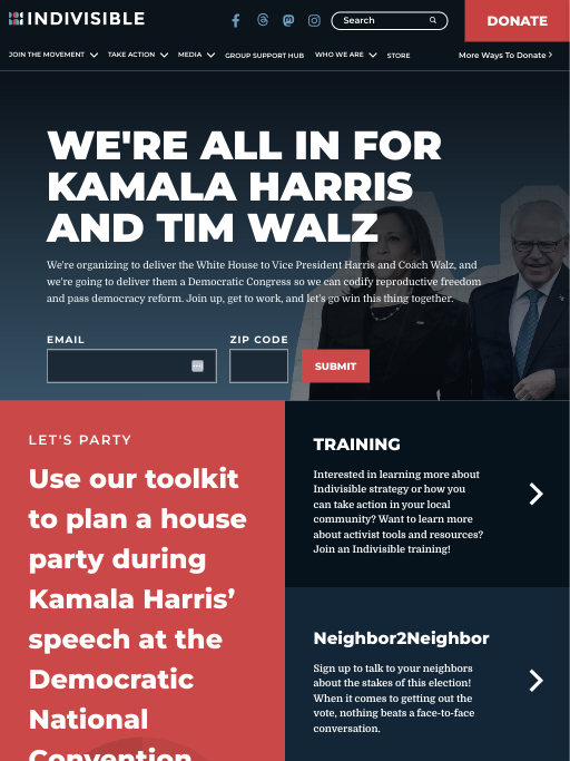
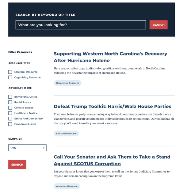
As the product and UX lead, I guided the redesign of Indivisible’s homepage and resource library to improve content management flexibility and enhance resource findability. The goal was to simplify content updates for internal teams while creating a more intuitive browsing experience for users. The redesign resulted in a 15% increase in user engagement and a noticeable reduction in bounce rates, demonstrating the effectiveness of a user-centered, collaborative approach.

Problem-Solving:
- Inflexible Content Posting: The previous homepage structure was rigid, making it difficult for content managers to update and prioritize content.
- Navigation Issues: The resource library lacked a clear structure, making it hard for users to find specific resources.
- Content Overload: Both the homepage and resource library were cluttered, overwhelming users with too much information.
- Inefficient Search: Underperforming search functionality hindered resource discovery.
Process:
User Research:
I conducted interviews with content managers and key users to understand their pain points. Research highlighted the need for more intuitive navigation and greater flexibility in content management.

Wireframing & Collaboration:
I created initial paper wireframes to outline a more flexible, modular homepage layout and a reorganized resource library with clear categories. These concepts were handed off to an external design firm, which fleshed out and refined the designs for implementation. Throughout the process, I collaborated closely with the design firm to ensure the solutions addressed user and business needs.
Development Partnership:
I partnered with the development team to implement improvements without requiring a major backend overhaul. Regular feedback sessions with internal teams ensured the solution was flexible, maintainable, and aligned with business goals.
Usability Testing:
We conducted usability testing to validate navigation and resource categorization. Content managers found the new layout easier to manage, while users reported faster access to critical resources.
Outcomes:
- User Engagement: Increased by 15%, as users spent more time interacting with the homepage and resource library.
- Bounce Rate: Decreased, as users found resources more efficiently.
- Resource Utilization: Higher utilization of categorized resources, reflecting improved discoverability.
Reflection:
This project underscored the importance of designing flexible, user-centered solutions that benefit both internal teams and end users. By improving navigation and resource discovery, the redesign boosted engagement and simplified internal workflows. Collaborating with a design firm also strengthened my ability to translate product vision into actionable design concepts, further developing my versatility as a product and UX leader.